Bloomingdale’s Browser Filter Section Redesigned
Design challenge
“For the past year, Bloomingdale’s has changed the website to be responsive, meaning it is consistent across all platforms.
For the browser experience, what could Bloomingdale’s improve on in regards to the user experience?”
I was given the above design challenge as part of my interview process with Bloomingdale’s UX team.
overview
According to comScore, tablet internet consumption grew 89% between 2013 and 2018. Smartphone internet consumption grew 82% during the same time period.

Designing a website structure that is a highly flexible in responsive design is crucial.
In order to provide a truly great user experience, web sites needs to be compatible with the different devices, operating systems, and browsers that the visitors are using.
With a responsive site, content is automatically resized and reshuffled to fit the dimensions of whichever device a visitor happens to be using.
browsers across different platforms
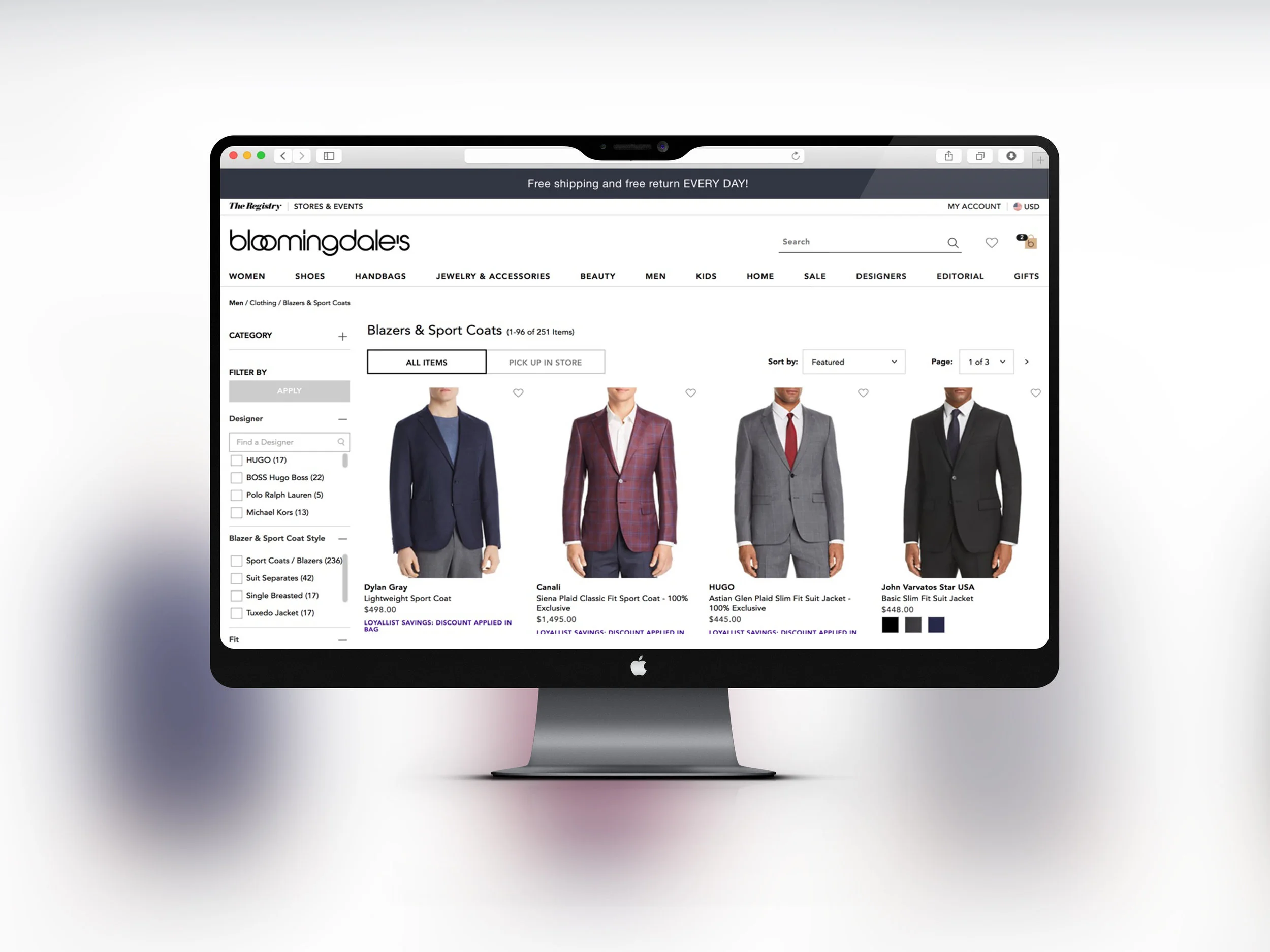
I started by examine the Bloomingdale’s homepage across different operating systems on different devices.
Mac vs. Windows
Android vs. iOS

Identifying user flow
After some browsing and going through flows under specific user scenarios, I found some discrepancies between the Windows browser and the Mac browser in terms of user flows. The same discrepancies continues from PC to Phone.
user research
Analysis of Bloomingdale's by Resonate, below is the demographic breakdown:

1) The shoppers at Bloomingdale's are most likely to watch late night shows such as The Daily Show, and Jimmy Kimmel Live.
2) Instagram is their favorite social media platform.
3) Most likely group to read Glamour, Cooking Light, and Entertainment Weekly.
4) They buy products that they deem to be rewarding.
5) Best looking products are prioritized by this group.
6) Most likely to shop online compare to customers of other department stores like Neiman Marcus and Saks Fifth Ave.
7) Also most likely to make impulse purchases while shopping.
Bloomingdale's existing customers have lots of online presence, and more likely to shop online.
I am surprised to find the gender ratio is 50/50. Bloomingdale's have a lot more male customers than I expected.
Also surprising to see the age group that made of most of the customer composition are younger at 18-44.
user persona
Based on the user research, I narrowed it down to two User Personas.
Both people are existing Bloomingdale's shoppers online and in store. I interview them in person and over the phone.


user story
"I want to buy a nice jacket for my friend's wedding next Saturday."
Benjamin and Miranda are both familiar with the Bloomingdale's website.
I said, "Imagine you want to buy a specific item from Bloomingdale's, walk to through each and every step of your shopping process, including what you are thinking. Start from opening the home page to adding an item to your bag."
Due to the time restriction of this design challenge, I will only select one user, and in this case I used Benjamin. I was able to sit next to him and interact with him while he go through the steps in his story. I observed and wrote down Benjamin's steps both mentally and physically. I also had him repeat the same steps with Safari on Mac and Explorer on Windows, as well as on his Iphone.

Based on his user journey, I formed the mental model on the right.
mental model

user flow: windows vs mac
I mapped out an existing user flow a customer would go through while browsing a specific product and adding it to the cart. The flow is based on Benjamin's journey.
While repeating the same steps on the Internet Explorer in Windows and Safari in Mac, the user have different paths. The flow chart on the right shows where the two differentiate.

My Takeaway:
Following this journey, I found the left sub-navigation is where the paths diverge and converge.
The Category and Filter functions are where the paths drifts apart.


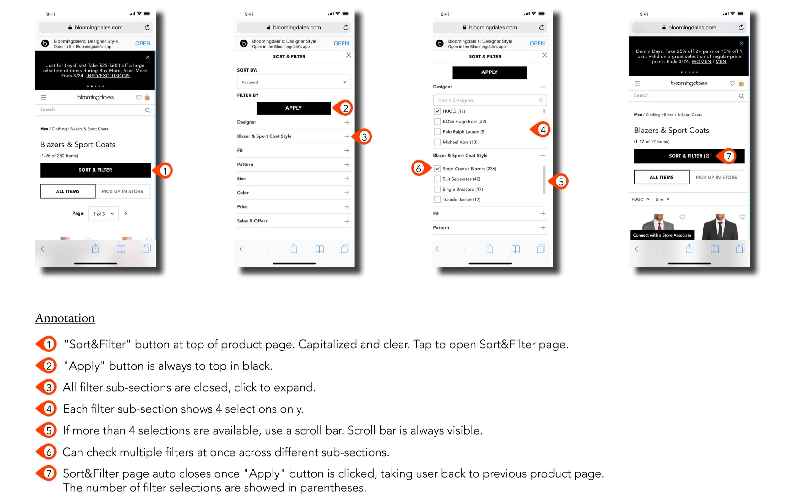
user flow on mac

Only list 4 line items under each filter category.
If more than 4, use scroll bar.
All scroll bars must be visible without actions.
Apply button always stays on top of the page.
low-fidelity wireframes


user flow on iphone

Unlike the repetitive clicking with a mouse on a computer, users find taping on the tablet or smartphone less annoying.
All scroll bars must be visible upon opening.
Sort&Filter page auto close after Apply button is clicked.
low fidelity wireframes

high-fidelity wireframes (sketch) & annotations


final thoughts
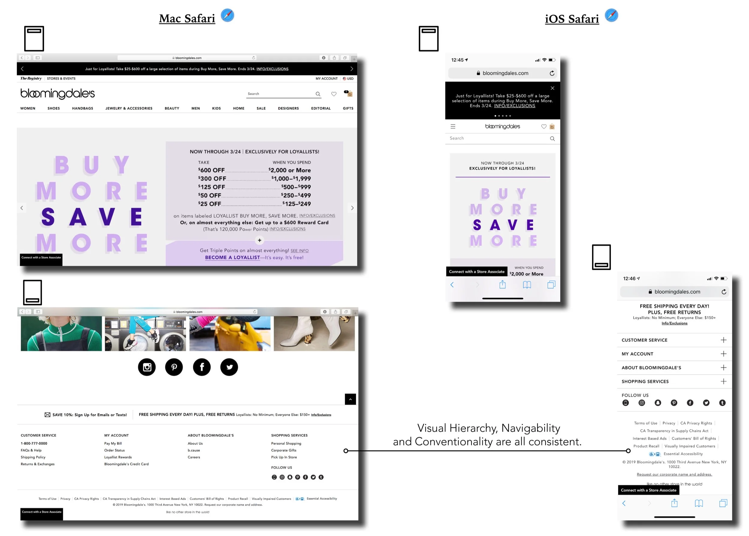
Bloomingdale's overall website is well designed and very efficient. The layout and contents are consistent across all different platforms.
For this design challenge, I chose to streamline the filtering process because I think this is the part that the user interacts with most frequently when browsing and making a purchase.
Ultimately, it's more important that the website provides a great experience across different platforms as opposed to having it look identical across those platforms.
ADDITIONAL IDEAS
People see Bloomingdale's as a forward fashion department store and brand.
As I was familiarize myself with the website, I noticed there is a Editorial section. Even though it's on the top main menu, it's hidden away on the second to last place with very low priority.
The Editorial page have fashion magazine like contents with amazing posts and curated fashion selection that looks like it's updated on a regular basis.

The monetization concept is in place, for example there are "The prom shop" and "The wedding shop". I think we there are opportunities here to make it more prominent.
It is a useful section. It adds to the Bloomingdale's brand, with great emphasis to the website not only as a sales portal.
Customers may come back and check the website more frequently to view the editorial contents, and not only for shopping purchase.
It may gets people to check the website for often. It could be on a more prominent location on the homepage, or link in other forms of social media like instagram.
