UX/UI & Documentation for GoBike,
a station free app based bike sharing for NYC.
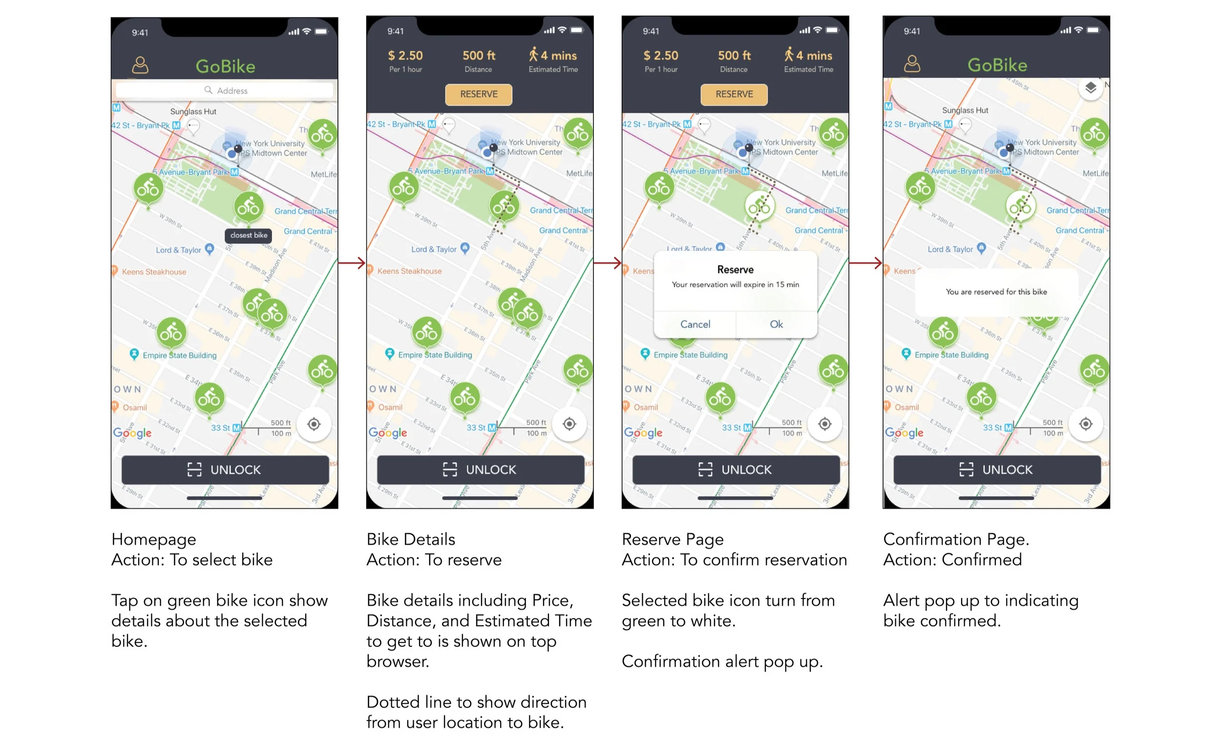
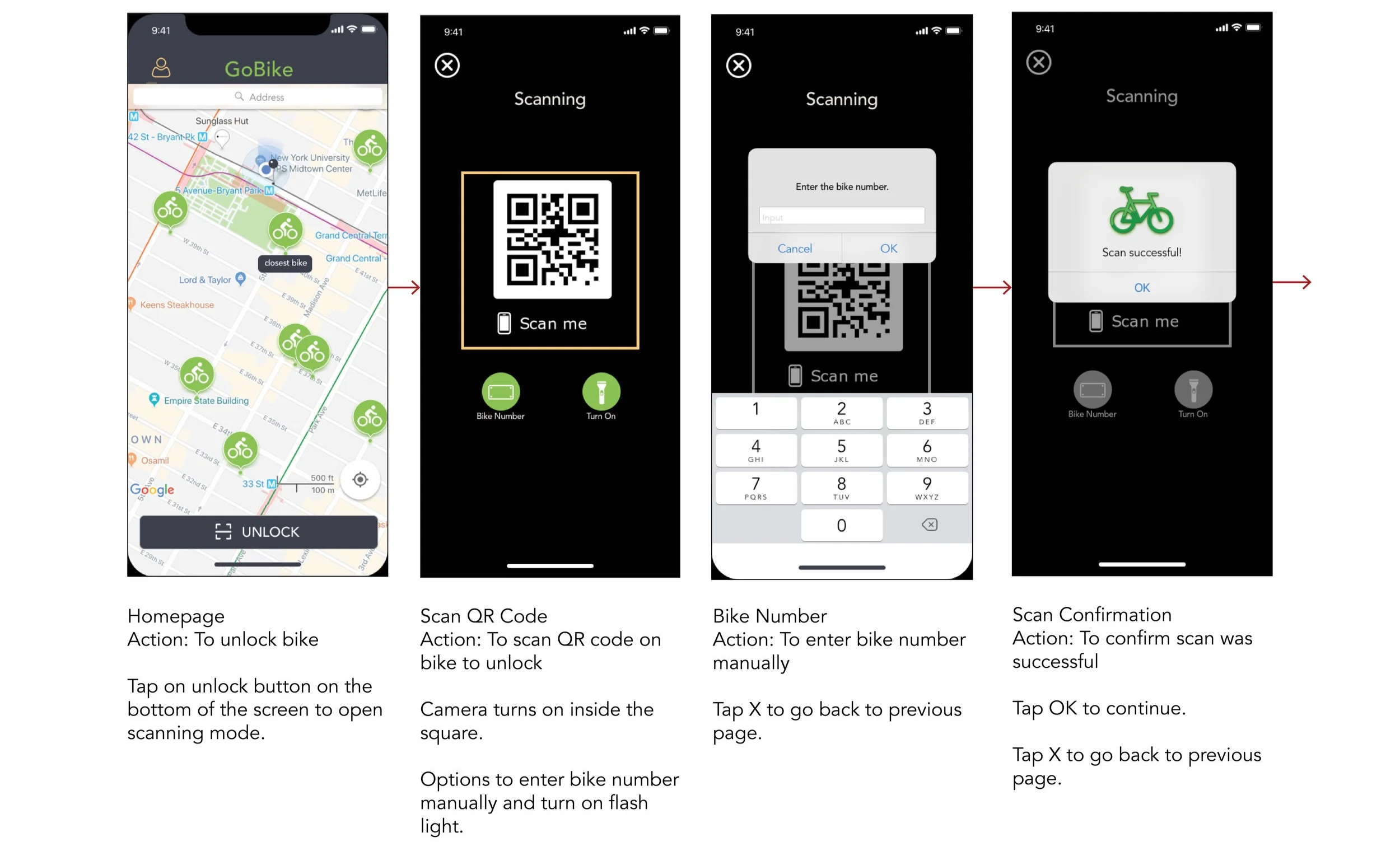
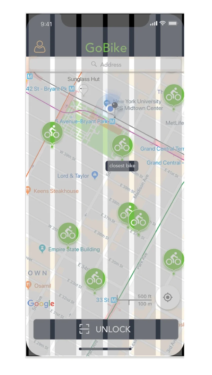
The design on the GoBike app is simple and vibrant. It is easy to use and navigate, everything you need is in the palm of your hands to give the best user experience.
Neutral and easy on the eyes tones with a pop of GoBike green with complimentary yellow.
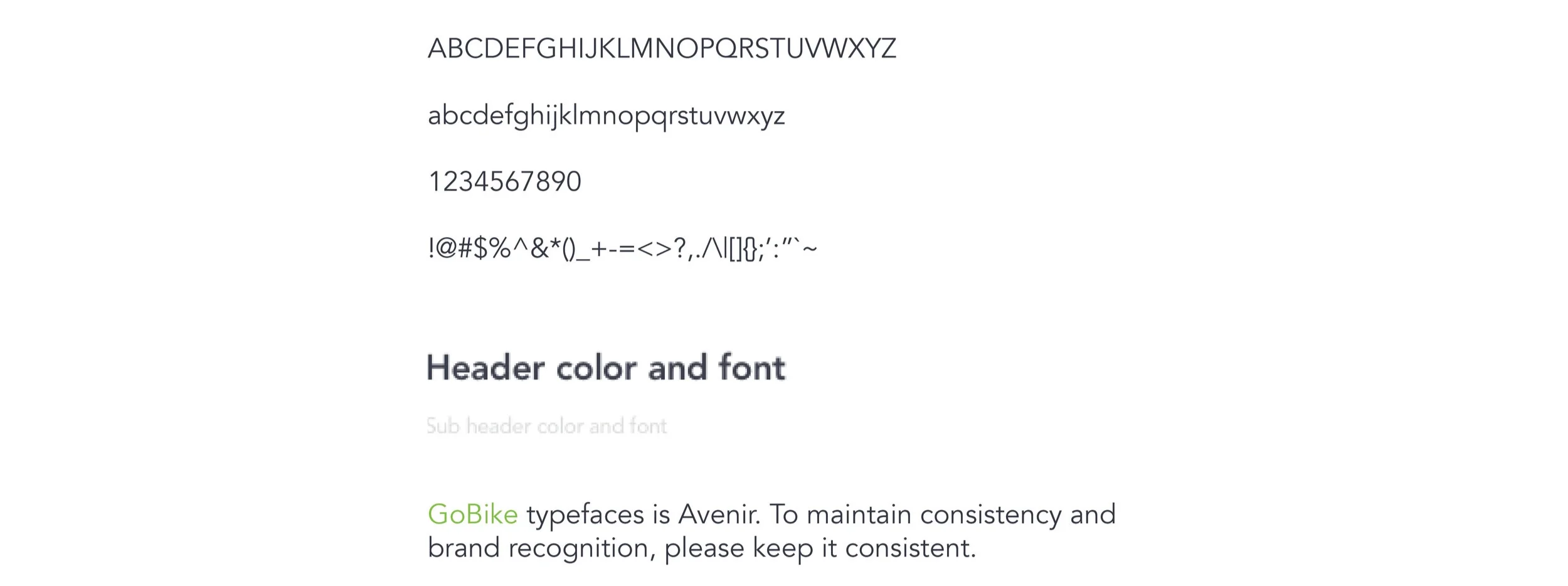
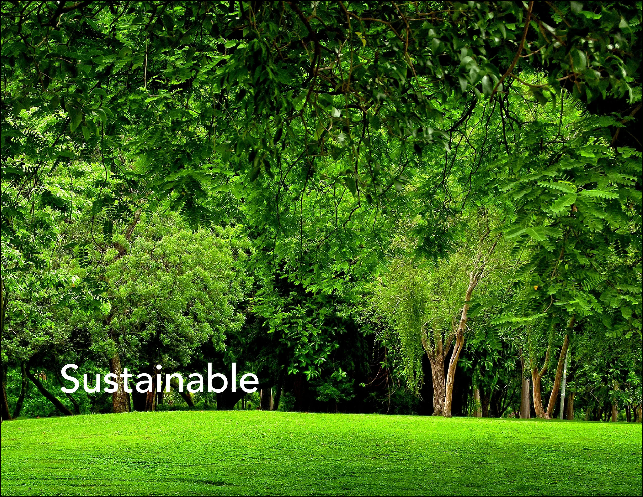
All the colors are taken from nature, to further accommodate the theme of green and sustainability, a round typography is used to give off a friendly vibe.
about this document
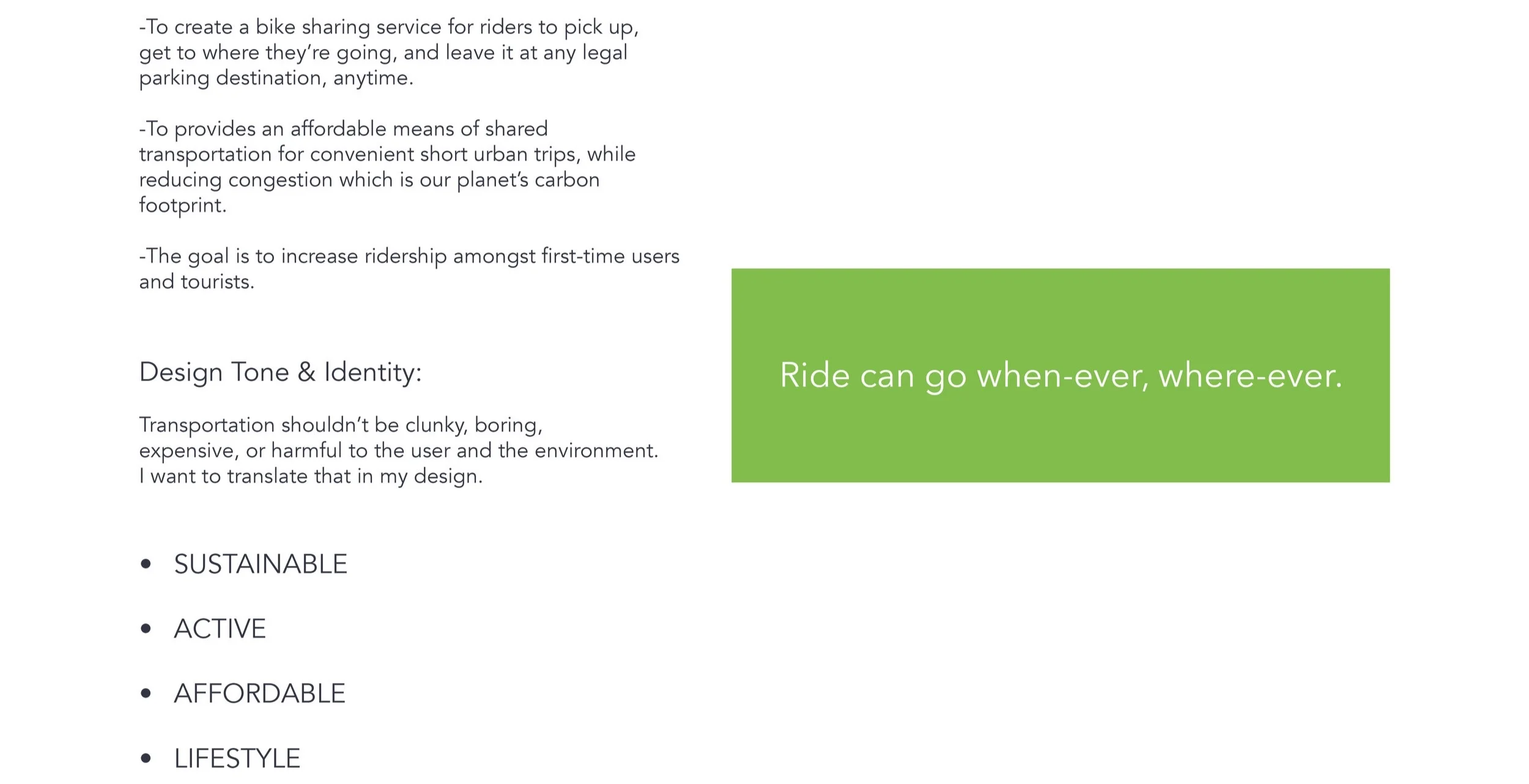
vision & scope
visual foundation
These guidelines are underpinned by research and an established visual foundation that informs every element.
The following pages document the research conducted to uncover the visual tone and experience of GoBike in the physical experience and in app, ensuring that all design elements remain consistent, on brand and high quality.
Keywords that inform the design

design tone
Transportation shouldn’t be clunky, boring, expensive, or harmful to the user and the environment. The brand identity is also translated into the design tone.
logos


The capital letter are to remain capital at all times.
The color of the logotype is clear background with green letters.
The logotype is set in capital “G” and “M”, with lower case “o”, “i” “k” “e”.
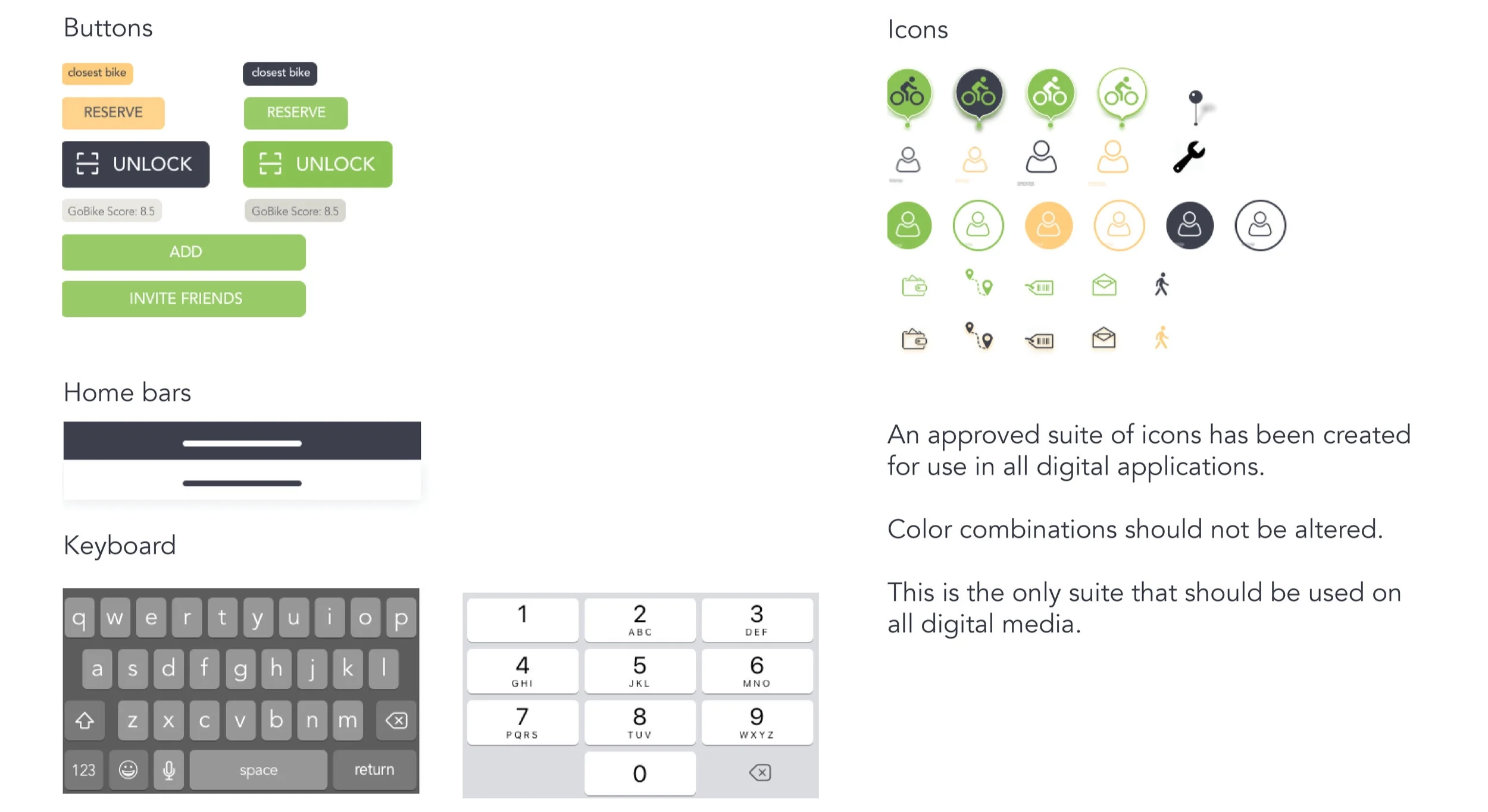
The color of the app icon (60x60) is green with a white bike icon.
how not to use logos
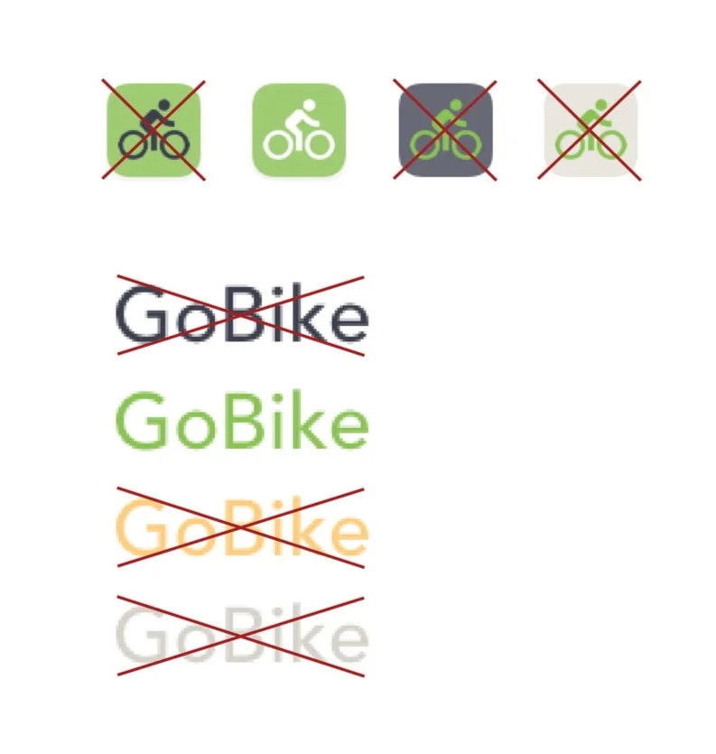
No other color variations or type settings are to be used.
No effect are to be applied.
design framework
Understand simplicity.
The design is built from a simple and structured framework that supports, rather than overpowers, the content.
The following pages outline the framework that forms the basis of all future design work.
color palette
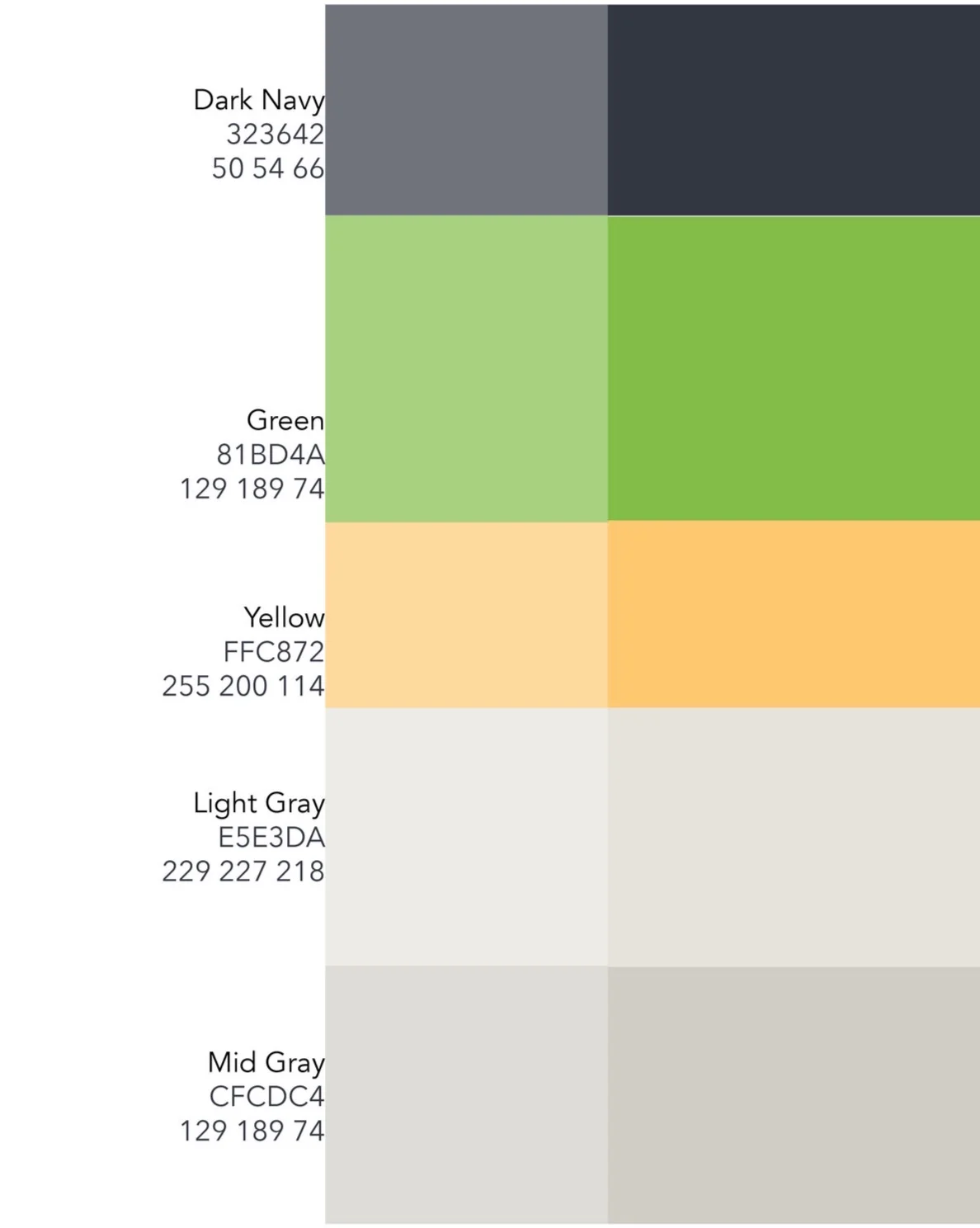
Rules if Color usage:
1. Use color in a functional, not a decorative way.
2. Use the green color sparingly.
3. Don’t use any other colors outside the set palette, except for white or black.
4. Use gradient effects sparingly.
5. Use tints, but ensure that color combinations remain legible.
6. Use gradient effects sparingly.
7. Use color only in 100% and 70% opacity.
8. Make sure colors used in combination are accessible to AA standards.
the grid
A flexible 6 column grid is used for all pages.
Offset 85px center, with gutter on the outside.
Gutter width: 12 px
Column width: 50 px